

Walking down the supplement aisle at the store, I felt completely lost. Shelves were packed with endless options—protein powders, multivitamins, probiotics—each claiming to be ‘essential’ for my health. But which ones did I actually need?
Every source seemed to say something different, and hiring a nutritionist wasn’t realistic.
That’s when I had an idea—what if there was a simpler way to find the right supplements? To explore this, I interviewed people facing the same struggle, designed solutions, and tested prototypes. Through research and iteration, I created a final design that makes finding the right products easy and stress-free.
UX Researcher, UX Designer
August 2023 - October 2023
Most people aren't sure what supplements they should be taking to meet their specific health goals. The overwhelming amount of options at stores can leave beginners confused and discouraged.
It also doesn't help that there is tons of contradicting information and misleading advertising out there. Doing your own research to find reputable resources would take too much time and effort, and hiring a personal nutritionist expert would be too expensive.
An online store that helps users find health supplements by recommending trustworthy products and providing factual information based on their specific needs and goals.
I identified my target audience as people who are working towards a fitness goal and are interested in purchasing health supplements. After finding 6 participants that matched those characteristics, I conducted interviews with them to learn about their motivations and pain points.
The amount of options for supplements is overwhelming and it takes too much time and effort to do research.
There is a lot of misinformation and shady advertisements on the Internet for products with false promises.
Hiring a personal nutritionist to figure out what supplements are compatible with your specific health needs is too expensive.
Supplement stores that are targeted towards body-builders and gym junkies are intimidating for beginners.

83% of participants weren't sure what supplements they should be taking.
83% of participants were discouraged by the amount of time and effort it would take to research what supplements would be good for them.

100% of supervisors have to re-open at least one timesheet due to errors every time period
.png)
Accountant | Blake Wilde
Age: 28
Location: Hilo, HI
Background
Goals & Frustrations
.png)
Retired | Martha Henson
Age: 65
Location: Honolulu, HI
Background
Goals & Frustrations
After I got a good idea of what my target audience was looking for, I started brainstorming the overall structure of the website and what features to include.


I met with 5 participants over video call to test my low-fidelity prototype and find areas of improvement.
.avif)
.avif)
.avif)
.avif)
.avif)
Click through the prototype or see links here:
VitaChoice High-Fidelity Prototype - Desktop
VitaChoice High-Fidelity Prototype - Mobile
These are all the features that directly address the four main pain points from my user research.

Unlike other supplement stores that specifically target body-builders, VitaChoice's branding and tone is friendly and inviting to anyone simply looking to improve their health. Customers do not need to leave their house or speak to anyone to get personalized, quality products.

Instead of spending several hours sifting through articles and books to find what supplements you need, all you need to do is take a simple 5 minute quiz.
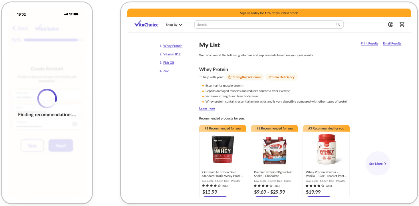
No need to spend hundreds on a personal nutritionist—get free product recommendations just with a few clicks.

Customers don't have to worry about fake or shady advertisements because VitaChoice only sells products that are safe and certified.
After going through the full design process from start to finish, I was able to create a final product that successfully helped users find trustworthy health supplements based on their specific needs and goals.
Since the end users of this particular project are people of all ages, backgrounds, and lifestyles, I had to empathize with various perspectives and realized just how important user research really is. Every interview with participants was valuable because I discovered something unexpected that I would have never thought of before. Even when something seems obvious to me, I learned that it is never safe to assume and it's best to learn from the end users themselves.


.avif)
.avif)
.svg)
.avif)